The world of design in classical music trends toward dry and stodgy, so our challenge was to create a brand identity that was both youthful and passionate that would meaningfully appeal to ESYO’s diverse constituencies: the youth members themselves, their parents, donors, teachers, and employees.
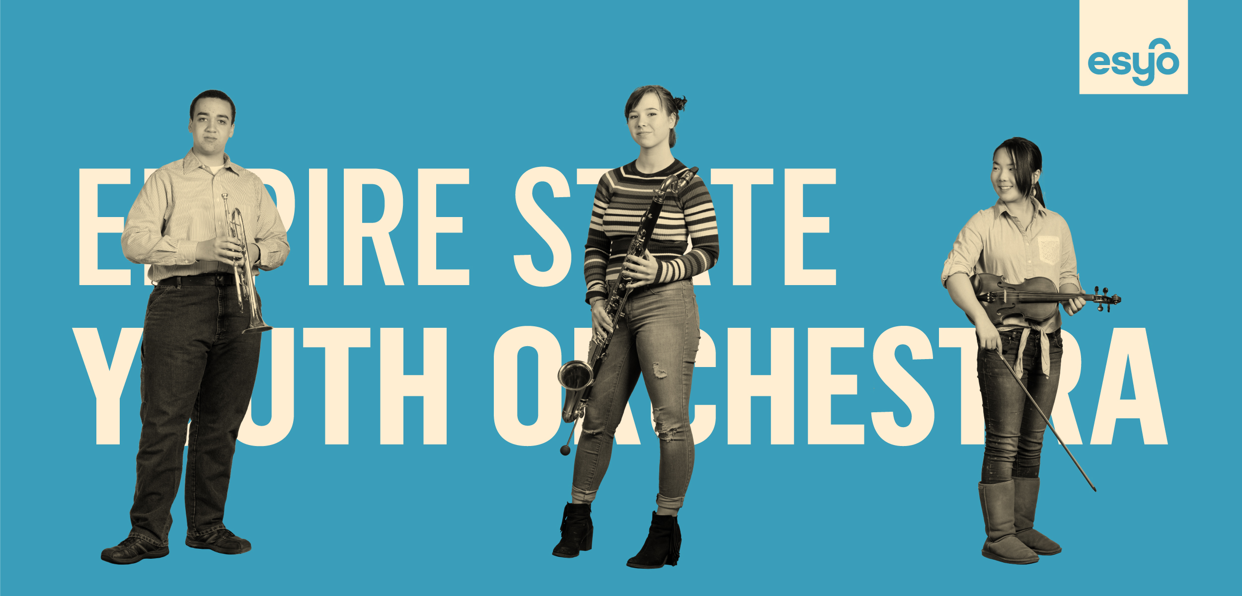
The Empire State Youth Orchestra (ESYO) is one of the country’s premier orchestral programs for young, up-and-coming musicians. It’s a statewide organization with a high bar for entry and a rigorous schedule of rehearsals, travel, and events. For many of the youth members, ESYO is a springboard to a conservatory and a profession in music. ESYO came to us last year with a brand that was aging and becoming increasingly fractured as the organization continued to grow and diversify.